How did you use new media technologies in the construction and research, planning and evaluation stages?
Wednesday, 2 May 2012

Thursday, 19 April 2012
ALL - Final Music Video (Rough Cut 7)
Audience: We showed this version of the rough cut to members of our A2 media class (all aged 17/18years old). This is an ideal audience to show the rough cut to because it fits within our primary target audience for the music video of 15-24year olds. Our teacher also gave us some feedback on this version of our music video and he in in keeping with our secondary target audience. In addition to this we showed it to adults at home who also fit with our secondary audience of original Robbie Williams followers from his time in Take That and when he first launched his solo career.
This is our last rough cut of our music video. We got feedback before we exported it:
This is our last rough cut of our music video. We got feedback before we exported it:
- Switch the clip with the spoons in the bowl and the i <3 U
- Used I <3 U twice so take out the first one
- performance on the rocks - zoe needs to come on screen quicker after sophie fades out
- when katie and nathan are holding hands by the window the shot shakes a lot
- add more crossfades between shots
- dull ending - change the light to blowing out candles. layer robbie and 3 gens fading in/out
We changed all of these things and then exported our final music video. We are very happy with it and the end product works very well.
Tuesday, 17 April 2012
ALL - Final Magazine Ad
This is our final magazine advert. Since our last draft we have just changed the name of the concert listed from Knebworth to Twickenham.


Monday, 2 April 2012
ALL - Magazine Ad rough cut 4
 |
| This is our final mag ad. After doing the improvements suggested, for example, adding spaces and making the Facebook and Twitter pages for Robbie's, we think this is a lot better before. Overall this works a lot better, the text is better lined and the font works well. There is enough detail to tell the audience what they want to know. It will relate to our primary audience which is 15-25 females because there is still the attractive Robbie and the link between the music video and the big 1 will relate to all audiences that have seen the video. |
ALL - Final Digipak after feedback
 |
| This is the front cover for our digipak. We made a few corrections like putting the DVD logo on |
 |
| This is our back cover. |
 |
| This is our middle part, I deleted the leg that was underneath the arm so it more obvious what it is. |
 |
| This is the spine, I changed the font colour to White after the feedback we got saying the black on black was clear enough, this also now fits in with the white theme |
Tuesday, 20 March 2012
ALL- Rough Cut 6 Feedback
Audience: We showed this version of the rough cut to members of our A2 media class (all aged 17/18years old). This is an ideal audience to show the rough cut to because it fits within our primary target audience for the music video of 15-24year olds. Our teacher also gave us some feedback on this version of our music video and he in in keeping with our secondary target audience.
- check the frame size is consistent throughout
- check lipsyncing lines up fully
- (0.21s) 'we were free' layering - playful footage
- Robbie walking up the steps - random. Only use once. first shot too short?
- Break performance up - window <3 shot?
- some shakiness which needs to be edited out or deleted
- (1.11s) drum - edit to the beat
- (1.21s) frame boys face better, get rid of girls hand from the corner
- also crossfade with the following shot
- motion tab - ask for help? 100% in point, 0% out point
- split 2 shot up where licking the spoon - add robbie
- shakes whilst licking lips - delete
- phone shot is too random, doesn't fit
- space in the sky and train - link phone in on a layer
- blowing out the candles - put where the track really slows down and almost stops
- end - use the candle being blown out rather than the light being turned off
- layer kids on concrete for CU of feet at station
- (2.10-2.11s) shakes
- (2.13-2.14s) edit to the beat when percussion comes in
- flare effects
- 'flying' something knocked over/being thrown
- train set - link with the older gen on the train
- train set - big shake - slow down more to solve?
- oldest gen - hands on bum - creepy? takes away from the mood of the song
- not innocent (take out)
- dancing gen1 layer with Josh gen 2 - multiple layers 3or4 - resize and reposition them
- speed up dancing ^
- whale 'looks like hes having a sexual encounter with the carpet' - either delete or layer the same shot over and over again
- layer the girls face over the rocks during performance shots
- in bed together - not innocent - wear pjs
- more shot variety for the Robbie performance shots
Thursday, 15 March 2012
Wednesday, 14 March 2012
JT - Problems with applying genre to video
Our music video genre is pop, this is what Robbie Williams is classed as. But we have challenged codes and conventions of the stereotypical pop genre.
The common conventions of music videos:
Common conventions in Pop Genre
The conventions we have used in ours
The common conventions of music videos:
 |
| Michael Jackson's Thriller Music Video, with dance scenes and digetic sound |
- Narrative/Performance/concept
- linear/non-linear
- layering
- lip syncing
- variety of locations
- male and female gaze
- choreography
- artist
- digetic sound/breaks (eg,Thriller, Kanye West, Tribute Song, Look At Me Now, Depeche Mode-Its no good, they exaggerated conventions and challenged them)
- fast pace editing
- props
- costume
- dancing
- framing
- special effects
- hybrid
- shot type
- discontinuity editing
- vary speeds of editing
- lighting
- instruments
- cutting to beat
 |
| Ed Sheeran Lego house, Uses instruments in video, guitar |
Common conventions in Pop Genre
- Dancing (Single Ladies-Beyonce)
- Lip Syncing (basically all pop music videos)
- Fast Pace Editing (Domino- Jessie J)
- Male and Female Gaze (Cheryl Cole- Fight For This Love)
- Sexual Reference (Katy Perry - California Girls)
 |
| Nicki Minaj Super Bass Lighting |
- Layering
- Variety of locations
- Lip Syncing
- Male/Female gaze (Laura Mulvey)
- Narrative/Performance
- Portrayed a hetrosexual relationship as the norm (normative)
- Constant narratve through out
- Performance seperate from narrative
 |
| Katy Perry Californa Gurls, Sexual Reference and Male Gaze |
- No Dancing
- Slowing down the editing
- Didn't put text on screen
- No digetic sound at begining and throughout

Thursday, 8 March 2012
JT - Rough Cut 5 Feedback
Audience: We showed this version of the rough cut to members of our A2 media class (all aged 17/18years old). This is an ideal audience to show the rough cut to because it fits within our primary target audience for the music video of 15-24year olds.
- Extreme long take of Jack at the begining, zoom in, cut to a shot of him walking, it doesnt have to be lip syncing
- She's the one: focus on girls, split screen?
- First two performance shots, on screen far too long and too much
- second performance: fade to black, cross disolve?
- Fade to black into instrumental section
- Layer performance
 Jack agaisnt the lampost, do it to the beat, use empty half, c/u of singers face or boy and girl either side
- Kids on too long eating cake mixture
- greater variation of robbie
- flying: slow down, ghosting effect (trailing), animated zoom
 Blowing out candles, what comes next, zooming into candle
- more multiple layer
- More shot variation
- Split screen - (1,2,3,4), pop up one by one
- link all candles
- Jack sat on rocks: more shots of it, to break up performance, jumping off the rock-flying
- look through all Jacks footage, see if we can get any to break up the video
- Jack on rocks, on too long
- pace and variation


Wednesday, 29 February 2012
ALL - Mag Ad Draft 3

This is the 3rd draft for our mgazine ad. Since the last one we have changed:
the font for the text
some of the wording for the product
We showed this nearly complete version of the magazine advert to both A2 media students (aged 17/18years old) who fit within our primary target audience of 15-24years old but also to some adults at home who fit within the secondary target audience of original Robbie followers who will remember his time in Take That and when he first launched his solo career.
|
ALL - Digipak Final
We showed this to our teacher who is part of our secondary audience and an original follower of Robbie Williams, remembering his time in Take That and when he first launched his solo career. We also showed this to some students in Year 13 who are part of our primary audience as they are aged 18years old.
These are our final designs fror our digipak.
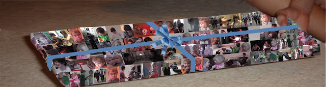
We feel that this digipak relates to our video because the front and back show the cheekyness of our performer (which is usually the way Robbie Williams is portrayed) and the inside is lots of little pictures from our film. We put a bow and ribbon on the present to make it look more obvious and 3D. The spine is the same as the front and back design.
We used Photoshop Elements to create all our digipaks (rough cuts and final piece). We didn't find it easy to create as after many tries with creating a digipak we didn't seem to grasp the genre, after feedback we realised that the original images looked 'too country' so we decided to re-shoot. We had problems with the writing as the font we picked for our final piece seemed to move the letters down from the original in line postition. We also had to use the Clone Stamp Tool to make the pictures big enough to fit the digipak canvas size.
Our research did help as we new the common codes and conventions of digipaks. It meant that creating the back cover, especially the small print and logos, we knew exactly what to put after looking back at our research.
From our research and feedback we developed the digipak, after changing many things that we recieved from feedback we think this is the better draft we have done. This digipak is based on audience feedback and without it we wouldn't got such a good product, although I am not keen on the inner panel as i don't think i works as well as it could.
 |
| Front Cover |
 |
| Back Cover |
 |
| Inner Panels |
 |
| Spine |
These are our final designs fror our digipak.
We feel that this digipak relates to our video because the front and back show the cheekyness of our performer (which is usually the way Robbie Williams is portrayed) and the inside is lots of little pictures from our film. We put a bow and ribbon on the present to make it look more obvious and 3D. The spine is the same as the front and back design.
We used Photoshop Elements to create all our digipaks (rough cuts and final piece). We didn't find it easy to create as after many tries with creating a digipak we didn't seem to grasp the genre, after feedback we realised that the original images looked 'too country' so we decided to re-shoot. We had problems with the writing as the font we picked for our final piece seemed to move the letters down from the original in line postition. We also had to use the Clone Stamp Tool to make the pictures big enough to fit the digipak canvas size.
Our research did help as we new the common codes and conventions of digipaks. It meant that creating the back cover, especially the small print and logos, we knew exactly what to put after looking back at our research.
From our research and feedback we developed the digipak, after changing many things that we recieved from feedback we think this is the better draft we have done. This digipak is based on audience feedback and without it we wouldn't got such a good product, although I am not keen on the inner panel as i don't think i works as well as it could.
ALL - Mag Ad draft 2
We showed this to our teacher who is part of our secondary audience and an original follower of Robbie Williams, remembering his time in Take That and when he first launched his solo career. We also showed this to some students in Year 13 who are part of our primary audience as they are aged 18years old.
This is the 2nd draft for our mgazine ad. Since the last one we have changed:
- the background
- the presentation of the date
- we have removed the image of the product we are advertising
- altered the text that accompanies the product
- added a list of his number ones
- Changed the layout of Robbie and Regeneration
By using only 'Robbie' instead of 'Robbie Williams' we are developing the conventions of magazines ads that we have researched.
We no longer need the image of the digipak itself because there is a clear connection between the two, in this case with Robbie leaning on the 1 which has replaced the lampost that is seen in the digipak.

ALL - Exam: 1B
- fairy skirt shows her innocence
- two shot - indicates at a relationship between them
- antique mise-en-scene and wooden floor - time period/higher class
- red table and chairs (plastic) - less expensive - child friendly
- felt tip pens - indication of age
- pink top on the girl - 'girly girl'
- white tights - impractical, colour of innocence and purity
- no make up - not appropriate for the age

Monday, 27 February 2012
ALL - Magazine Ad Rough Cut
This is the first draft of our magazine ad that we created in Photoshop Elements 4.0.


Subscribe to:
Posts (Atom)